.png)
Redesign Overview
- Introduction
- Research
- Ideation
- Iteration
- Analysis + Take Aways
- Final Product
Introduction
This redesign was undertaken for my first ever client, Côte Bonneville. This winery has a rich, although relatively short heritage producing some of the best red wines out of Washington State, while also growing the best grapes in the state. Their pedigree is backed by high ratings and multiple articles from wine spectator, the wine enthusiast, and many other notable publications.
Post pandemic, wine sales have shifted to e-commerce and Côte Bonneville has been making an effort to modernize to this new trend. Their chief complaints coming to me was that the current avenues to sign up for their new wineclubs wasn't clear enough, and that their pedigrees (wine ratings) were not visible to visitors. They also wanted to tie in their vineyards to the website and emphasize that their estate grown grapes are part of what makes their wines what they are.
Research
To begin things I needed to understand where users were feeling frusterated in navigating the website. To understand this I was able to interview a customer in the client's tasting room after he made a purchase. Through this interview of a target user I was able to come to a few possible pain points. This was one weak point in this redesign due to a small sample size of users.
To further investigate this problem space I looked at what other wineries in the area had in terms of e-commerce and how they offered it, or if they even had it. What I found was that most did not, and if they did, they used the same software that Côte Bonneville used. The one differentiating factor was that Côte Bonneville hosts their own website. Other wineries also suffered from poor UX and unclear user pathways and were not optimized to sell or advertise their wines. It was immediately clear to me that there was not much thought to the layouts or navigation from a user's perspective.
Ideation
There were several problems I had to solve:
- Increase visibility of the, pedigrees, wineclubs, and e-commerce
- Simplify the wine purchasing pathway
- Update the website's layout and feel to better represent the winery's image
visibility
The first thing I wanted to do was to add the wineclub and shop directly to the navigation bar to help increase the visibity, and make it easy for a user to access them from where ever they are in the page. Before the redesign, the nav bar also included several unneccesary pages and links which I removed to declutter it to bring more attention to the e-commerce tabs.
Additionally I wanted to add calls to action thorughout the pages to encourage users to navigate towards one of the e-commerce pages. The placement of these calls to action were added specifically after verbage describing either the winery's pedigree, or information describing characteristics of wine/vineyards.
pathways
The original website was designed to read as a story, where a user would land on an intro to the winery and it was intended that a user read through each page until they were able to purchase wine after reading on the history of the winery and vineyards. This organization mixed with a cluttered nav bar reduced the ability for people to get directly where they wanted.
This was remedied by simplifying userflows to almost always end up in one of the e-commerce tabs, and simplifiying the about tab to include all elements of the winery, in an interconnected series of webpages that covered everything from their humble beginnings, to the history of their tasting room.

First iteration of the the site's information architecture preseneted to the client
image
Working closely with the CEO, I tailored the text, and imaging to produce a classic, refined feel while maintainging legibility for target users. I also updated the imagery to better define the brand's wine as described to me by the CEO.
Iteration
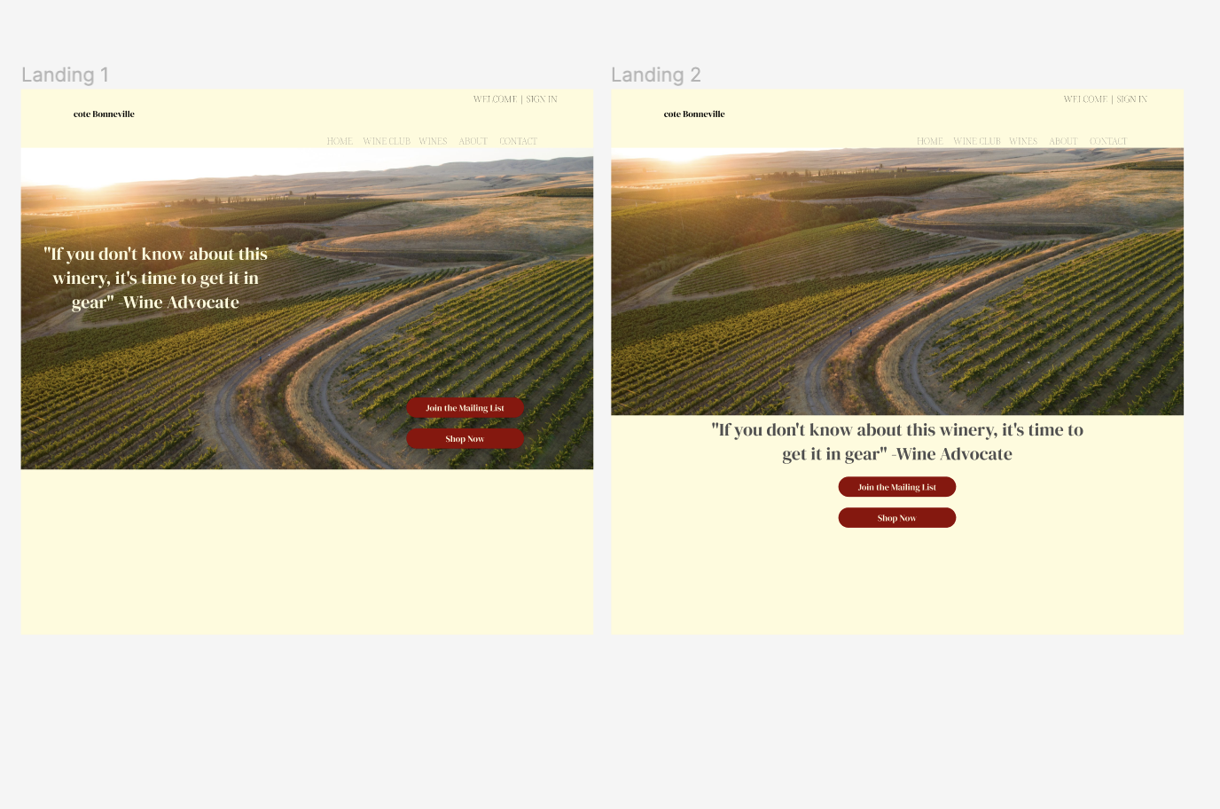
After coming up with ways to solve the problems presented to me, I followed through with some rough wireframes and Information Architecture outlining my vision for the new face of Côte Bonneville on the internet. Using figma, I was able to rapidly test out new button placement, test out new flows for purchasing wine, signing up for news letters, and pushing the winery's wineclubs.

Two medium fidelity versions of the landing page for Côte Bonneville
After rounds of user testing, I would take feedback and adjust as necessary before coming to a final design that was eventually pushed live in late September.
Analysis + Take Aways
One of the first things that I recognized was the need to balance a stakeholder's needs with their wants. I found that these two often conflicted in artistic preference and best possible product. While I might suggest a change to better improve usability, a stakeholder might want to keep something as is. Compromising to find a middle ground to best serve their primary interests while also keeping them happy with the design became critical to the success of the redesign.
- Overall the redesign was successful on several metrics. Through improved SEO, traffic through the page increased 12% in a three month interval after the changes were pushed.
- Wineclub retention also increased 55% quarter over quarter after the changes were pushed.
- Wine sales thorugh their e-commerce shop rose 5% quarter over quarter after changes were pushed live.


.png)